Add a container element with the class form-autocomplete. There are 2 parts of it, one is form-autocomplete-input, another is menu component. You may add the class is-focused to form-autocomplete-input to make it appear as focus state.
Spectre.css does NOT include JavaScript code, you will need to implement your JS to interact with the autocomplete. The autocomplete HTML structure is exampled below.
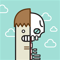
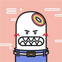
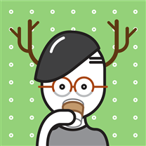
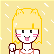
Add the class avatar to <img> element. There are 4 additional sizes available, including avatar-xl (64px), avatar-lg (48px), avatar-sm (24px), and avatar-xs (16px). By default, the avatar size is 32px.
For users who don't have profile pictures, you may use their initials for avatars. Add the class avatar and avatar size class to <div> element. The attribute data-initial is the name appear inside the avatar.
<!-- Basic avatar examples -->
<figureclass="avatar avatar-xl">
<imgsrc="img/avatar-1.png" />
</figure>
<figureclass="avatar avatar-xl">
<imgsrc="img/avatar-1.png" />
<imgsrc="img/avatar-5.png"class="avatar-icon" />
</figure>
<figureclass="avatar avatar-xl"data-initial="YZ"style="background-color: #5764c6;"></figure>
<!-- Show initals when avatar image is unavailable or not fully loaded -->
<figureclass="avatar avatar-xl"data-initial="YZ"style="background-color: #5764c6;">
<imgsrc="img/avatar-1.png" />
</figure>
Badges
Badges are often used as unread number indicators.
Notifications
Notifications
Notifications
Notifications
Add the class badge to non self closing elements. And add the attribute data-badge to define the content of a badge. The badge will appear in the top-right direction of the element.
If there is no data-badge or the attribute is not specified, the badge will appear as a dot.
Bars represent the progress of a task or the value within the known range. Bars are custom components for displaying HTML5 progress and meter elements.
25%
15%
10%
15%
Add a container element with the class bar. And add child elements with the class bar-item. The width percentage value is needed for every bar-item.
There is a class bar-sm for thinner Bars. Also, you could use Tooltips for any bar-item.
Empower every person and every organization on the planet to achieve more.
Apple
Hardware and software
To make a contribution to the world by making tools for the mind that advance humankind.
Google
Software and hardware
Organize the world’s information and make it universally accessible and useful.
Surface Studio. Turn your desk into a Studio. Surface Studio is designed for the creative process.
Apple
Hardware and software
To make a contribution to the world by making tools for the mind that advance humankind.
Google I/O
Software and hardware
An immersive, three-day experience focused on exploring the next generation of technology, mobile and beyond.
Add a container element with the class card. And add child elements with the class name card-image, card-header, card-content and/or card-footer. The card-image can be placed in any position.
<divclass="card">
<divclass="card-image">
<imgsrc="img/osx-el-capitan.jpg"class="img-responsive" />
</div>
<divclass="card-header">
<h4class="card-title">Microsoft</h4>
<h6class="card-meta">Software and hardware</h6>
</div>
<divclass="card-body">
To make a contribution to the world by making tools for the mind that advance humankind.
</div>
<divclass="card-footer">
<buttonclass="btn btn-primary">Do</button>
</div>
</div>
Chips
Chips are complex entities in small blocks.
Add a container element with the class chip. And add child text element, buttons or avatars with the class avatar.
Dropdown menus component is built entirely in CSS. It is triggered by :focus event.
Add a container element with the class dropdown. And add a focusable element with the classname dropdown-toggle for the button and a menu component right next to it. If the dropdown is close to the right edge of the browser, you can add the class dropdown-right to the container to prevent it appearing off screen.
Also, you can implement your JS to interact with the dropdown menus by adding the class active to the dropdown.
Add a container element with the class menu. And add child elements with the classname menu-item. You can separate menu items with a divider or menu-header. Spectre.css does not include JavaScript code, you will need to implement your JS to interact with the menus.
<ulclass="menu">
<!-- menu header -->
<liclass="menu-header">
<spanclass="menu-header-text">
Go to
</span>
</li>
<!-- menu item -->
<liclass="menu-item">
<ahref="#">
<iclass="icon icon-link"></i> Slack
</a>
</li>
<liclass="menu-item">
<ahref="#">
<iclass="icon icon-link"></i> Hipchat
</a>
</li>
<liclass="menu-item">
<ahref="#">
<iclass="icon icon-link"></i> Skype
</a>
</li>
<!-- menu divider -->
<liclass="divider"></li>
<liclass="menu-item">
<ahref="#">
<iclass="icon icon-link"></i> Settings
</a>
</li>
</ul>
Lorem ipsum dolor sit amet, consectetur adipiscing elit. Praesent risus leo, dictum in vehicula sit amet, feugiat tempus tellus. Duis quis sodales risus. Etiam euismod ornare consequat.
Climb leg rub face on everything give attitude nap all day for under the bed. Chase mice attack feet but rub face on everything hopped up on goofballs.
Efficiently unleash cross-media information without cross-media value. Quickly maximize timely deliverables for real-time schemas. Dramatically maintain clicks-and-mortar.
Caerphilly swiss fromage frais. Brie cheese and wine fromage frais chalk and cheese danish fontina smelly cheese who moved my cheese cow.
Add a container element with the class modal. And add a real container modal-container and overlay modal-overlay inside it. You can add child elements with the class name modal-header, modal-content and modal-footer - any or all of them.
Spectre.css does not include JavaScript code, you will need to implement your JS to interact with modals. To make a modal appear, add the class active to the modal container.
Add a container element with the class tab. And add child elements with the classname tab-item. You can add the class tab-block for a full-width tab. The tab-item or its child <a> with the class active will be highlighted.
Add a container element with the class pagination. And add child elements with the classname page-item. The page-item with the class active will be highlighted.
Add a container element with the class nav. And add child elements with the classname nav-item. The nav-item with the class active will be highlighted.
Add a container element with the class step. And add child elements with the classname step-item. The step-item with the class active will be highlighted and indicate the current state of progress.
Tiles are repeatable or embeddable information blocks.
The Avengers
Earth's Mightiest Heroes joined forces to take on threats that were too big for any one hero to tackle...
The S.H.I.E.L.D.
The Strategic Homeland Intervention, Enforcement, and Logistics Division...
Add a container with the class tile. And add child elements with the class name tile-icon, tile-content and tile-action. The tile-icon and tile-action are optional.
There are tile-title and tile-meta classes for title and meta text styles.
<divclass="tile">
<divclass="tile-icon">
<divclass="example-tile-icon">
<iclass="icon icon-explore centered"></i>
</div>
</div>
<divclass="tile-content">
<pclass="tile-title">The Avengers</p>
<p>Earth's Mightiest Heroes joined forces to take on threats that were too big for any one hero to tackle...</p>
</div>
<divclass="tile-action">
<buttonclass="btn btn-primary">Join</button>
</div>
</div>
There is compact version of Tiles component, which is often used as contact and file info blocks.
Add the class tile-centered to the container tile. The tile-icon, tile-content and tile-action will be vertically centered.
Toasts are used to show alert or information to users.
Lorem ipsum dolor sit amet, consectetur adipiscing elit.
Add a container element with the class toast. You can add any text within the container, and even icons. You may also add a close button with the class btn-clear if you need.
Toast primary
Toast success
Toast danger
And you can add the class toast-primary, toast-success or toast-danger for additional toast colors.
<divclass="toast">
<buttonclass="btn btn-clear float-right"></button>
Lorem ipsum dolor sit amet, consectetur adipiscing elit.
</div>
<divclass="toast toast-primary">
<buttonclass="btn btn-clear float-right"></button>
<iclass="icon icon-error_outline"></i>
Lorem ipsum dolor sit amet, consectetur adipiscing elit.
</div>
Tooltips
Tooltips provide context information labels that appear on hover and focus.
Tooltips component is built entirely in CSS.
Add the class tooltip and the attribute data-tooltip, which contains the tooltip content, to non self closing elements. And add the class name tooltip-right, tooltip-bottom or tooltip-left to define the position of a tooltip. By default, the tooltip appears above the element.
<buttonclass="btn tooltip"data-tooltip="Lorem ipsum dolor sit amet">top tooltip</button>
<buttonclass="btn tooltip tooltip-right"data-tooltip="Lorem ipsum dolor sit amet">right tooltip</button>